I love these roses, they took for ever to draw, I used a black fine liner and used dots to add tone. Thinking they will look good on a nice gift wrap.
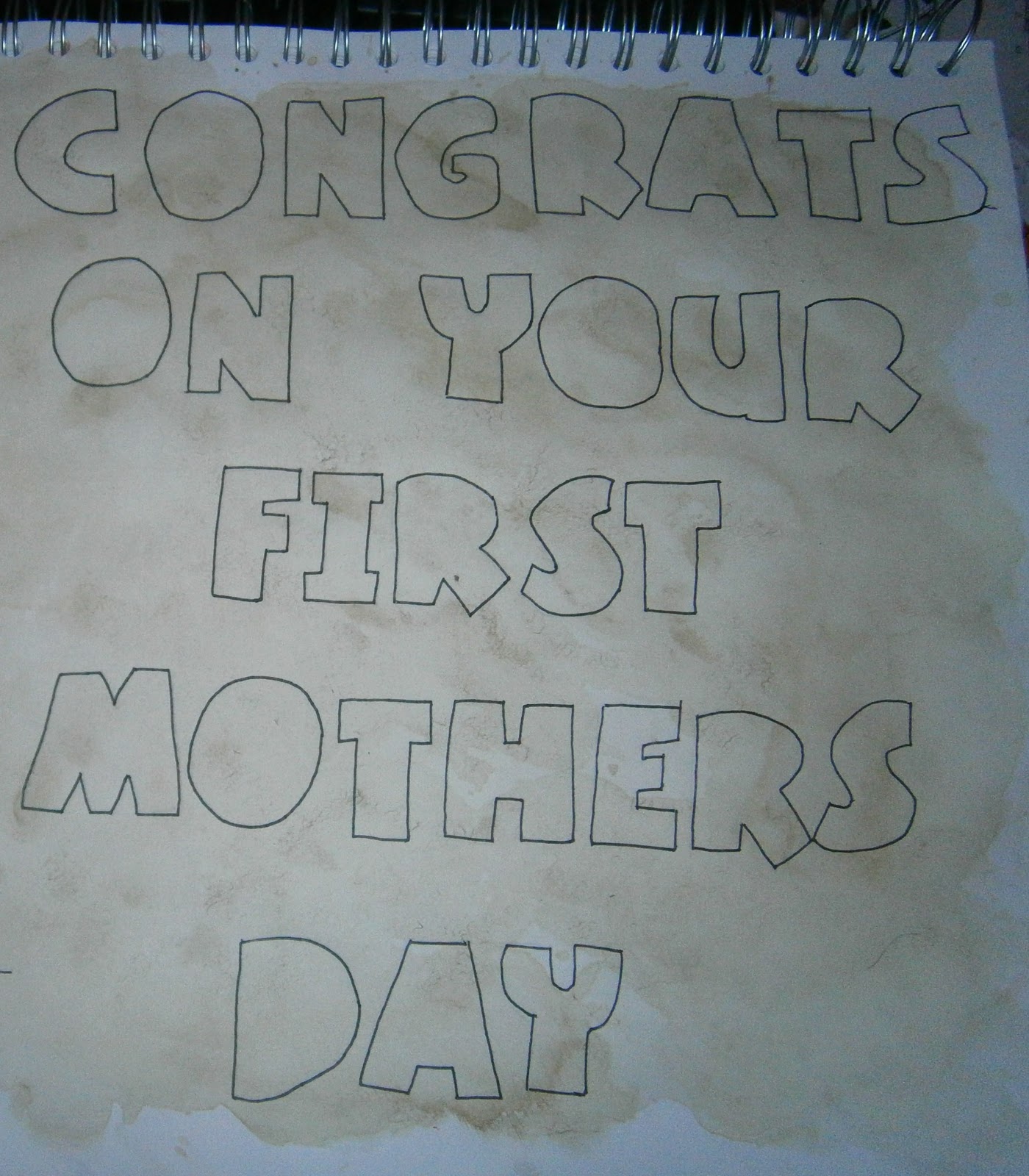
Experimenting with lettering styles.


All drawing sheets start off somewhere.


I really enjoy using dots to create tone.

A complete drawing sheet.


I think these tea pots will work really well on a card or gift wrap.


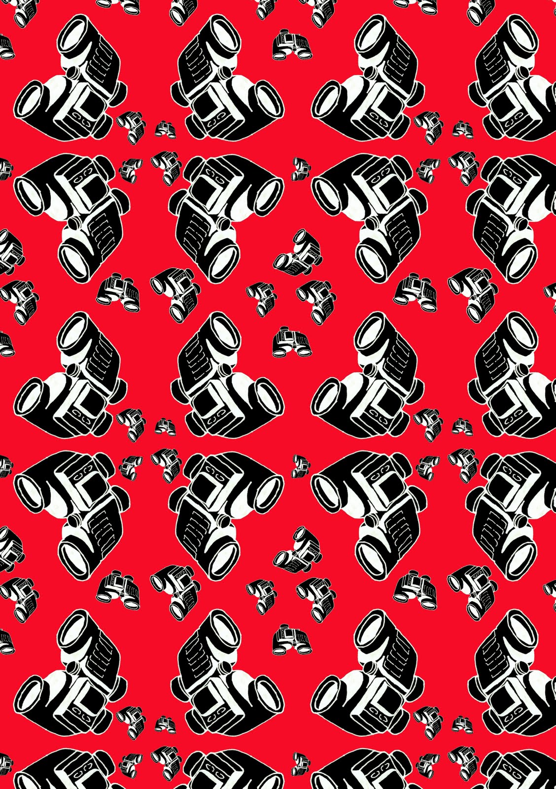
This is how my first design started out life. I used Adobe Photoshop to clean up the images and put them into a pattern.

Although I really like the colours and I think the pattern is really good I am going to have to rearrange a few of the glasses as they touch where I don't want them too. I think I will try my hand at a slight half drop repeat.

I altered the design by starting out with the small glasses and not taking the design right to the edge.

Complete design.


Experimenting with different colour ways.


I have introduced buttons alongside the wine glass in this wrapping paper design.


This is the design in blue, I think it works well in this colour, but I think other colours may make the wine glass 'pop' a little more.

I love the design in this colour, I think the buttons are complemented well by the colour adn the wineglass stands out just the right amount.

Although I love this orange and I think it works well with the buttons, the wineglasses look lost.


I made the design larger to see if it would work better. I don't think it does.

Although I think this design works better smaller, I love this off yellow colour!

Here I have experimented with my flower and wine glass drawing, I think it works really well with the teal.

This is the final outcome...in teal.

This was the design before I added the 'little flower', I think the 'little flower' adds more defination and interest to the wrapping paper design.

I have taken out the smallest of the flower to see how the design would look without. Although I like the design I don't think it is 'final design quaility'.


Here I have combined the 'heart hands' with the Roses. I changed the opactity of the flower so they were not just white and floating around.

When I changed the background colour, the Roses did not change. I think this accident worked to my advantage as I think it really brings in the vintage feel I am trying to achieve with my designs.

Im starting to consider that the hands are a little too faint for this design....


I have removed the 'heart hands' and introduced more Roses, I think this works really well and visually it is really good and the colours really complement eachother.